Customer retention is the backbone of sustainable growth. While acquisition grabs attention, retention turns first-time customers into loyal advocates. One of the most effective visual tools for understanding retention is the funnel chart. By mapping user journeys through key stages, teams can pinpoint where interest fades and where momentum carries customers forward.
In this guide, how to monitor customer retention using funnel charts shows how to build and interpret funnels to reduce churn and increase lifetime value.
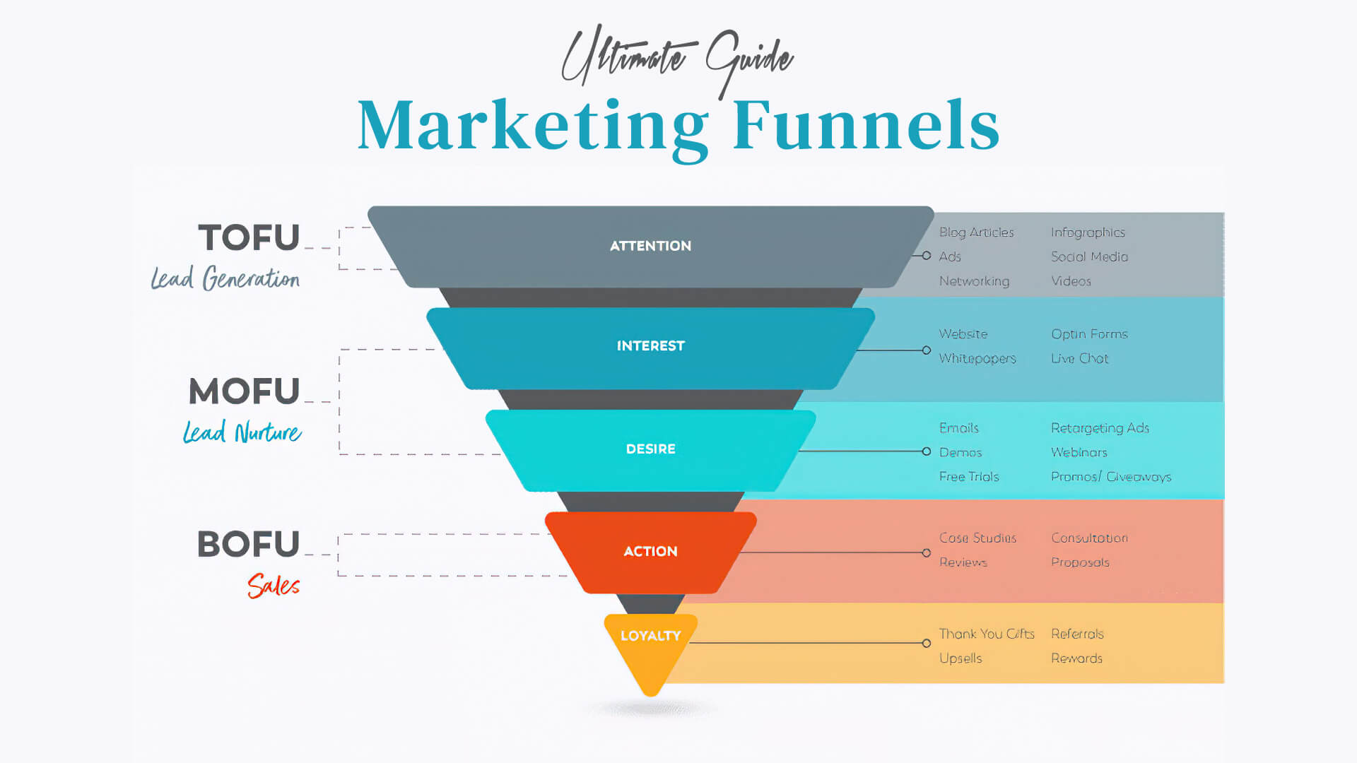
Define the stages of your funnel
Start by outlining the stages that matter for your product or service. A typical funnel might include: Sign-up or start, Activation (first meaningful action), Retention (repeat visits or usage within a period), Revenue (first paid action or renewal), and Referral (share or advocate). You can tailor the stages to your funnel—SaaS, ecommerce, or mobile apps all benefit from a well-defined path. The goal is to create a clear sequence that you can monitor over time.
Collect the right data
Funnel charts rely on events and properties. Ensure your analytics tool records each stage as a discrete event and captures attributes such as acquisition channel, plan, cohort, and date. Clean, consistent data is essential; inconsistent naming or missing values can distort the chart and lead to incorrect conclusions.
Build and visualize the funnel
Most analytics platforms offer a funnel visualization feature. Choose a tool you already use—GA4, Mixpanel, Amplitude, or a business intelligence dashboard. Create a multi-step funnel that tracks the user from the initial sign-up to the final retention or revenue milestone. A funnel chart makes it easy to see drop-offs at each stage and compare performance across segments.
Interpret the numbers
Key metrics to watch include the drop-off rate between stages, the overall conversion rate through the funnel, and retention rate within a chosen window (e.g., 30 days post-onboarding). By examining how these numbers vary by cohort, channel, or plan, you can identify where your onboarding or product experience needs tightening. For example, a steep drop after activation may signal onboarding friction, while a low retention rate after the first week may indicate engagement gaps.
Segment and experiment
Segmentation unlocks deeper insights. Break the funnel by acquisition channel, device, geography, or user segment. Run experiments—A/B tests of onboarding flows, feature prompts, or re-engagement campaigns—to lift the funnel’s conversion at critical stages. Use the funnel view to compare results before and after changes, keeping a laser focus on retention improvements.
Turn insights into action
Data should drive action. If you see a high drop-off at onboarding, simplify the first-run experience and provide clearer guidance. If first-week engagement is weak, introduce nudges or personalized messages to re-engage users. Create retention-focused playbooks: onboarding checklists, automated emails, in-app guidance, and incentives that encourage continued use without overwhelming the user.
Start today
Exercise: map your current customer journey into a simple 4–5 stage funnel, gather the data, and review the chart for the next 30 days. Schedule a weekly retention review and assign owners for each stage improvement. The practice of regularly reviewing funnels helps ensure your product evolves to meet customer needs while preserving long-term loyalty.
For more resources and insights, visit the MarketerAl homepage.